

Daisy UI is a pretty interesting CSS framework to help you hit the ground running with Tailwind as it provides some reasonable default components.
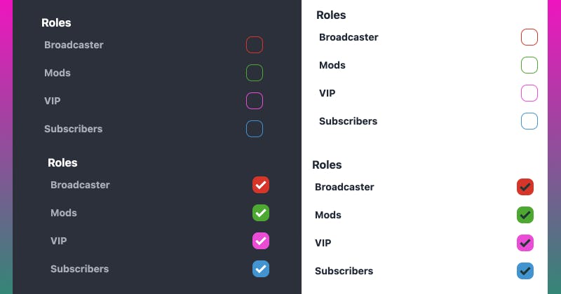
They have a checkbox component with a cute animation, but unfortunately it's only available in limited colours.
That wasn't enough for me. I wanted to have a checkbox of any colour. The CSS is a bit complex, and after wrestling with it, I came up with a quick and easy way to make checkboxes of any colour with the help of a Sass mixin. It's easy to use, you just pass in the HSL value (without the commas).
@mixin custom-checkbox($color) {
  --a: #{$color};
  --chkbg: var(--a);
  --chkfg: var(--ac);

  --tw-border-opacity: 1;
  border-color: hsl(var(--a) / var(--tw-border-opacity));

  &:checked, &[checked=true], &[aria-checked=true] {
    --tw-border-opacity: 1;
    border-color: hsl(var(--a) / var(--tw-border-opacity));
    --tw-bg-opacity: 1;
    background-color: hsl(var(--a) / var(--tw-bg-opacity));
    --tw-text-opacity: 1;
    color: hsl(var(--a) / var(--tw-text-opacity));
  }
}
It's used as follows:
.checkbox-red {
  @include custom-checkbox(1 83% 50%);
}

.checkbox-green {
  @include custom-checkbox(120 97% 34%);
}

.checkbox-pink {
  @include custom-checkbox(311 100% 61%);
}

.checkbox-blue {
  @include custom-checkbox(198 100% 42%);
}
You can get the HSL values in Chrome's colour picker fairly easily if you already have an instance of the colour on the page.
If you want to see me struggle with figuring this out (with the help of the super helpful Twitch community) you can watch the full stream recording.
If you like that content, you can follow me on Twitch and come hang out with us!
If you have any other tips for working with Tailwind and DaisyUI, feel free to leave it in the comments. It was my first time trying Tailwind and so far I'm digging it.